Safety signs:
a sign providing information or instruction about safety or health at work by means of a signboard, a color, an illuminated sign or acoustic signal, a verbal communication or hand signal.
Safety boards:
a sign which provides information or instructions by a combination of shape, colour and a symbol or pictogram which is rendered visible by lighting of sufficient intensity.
Safety colors:
a colour to which a specific meaning is assigned (eg yellow means ‘be careful’ or ‘take precautions’)
Safety signs are used to:
• draw attention to health and safety hazards
• point out hazards that may not be obvious
• provide general information and directions
• remind employees where personal protective
• equipment must be worn
• show where emergency equipment is located
• indicate where certain actions are prohibited
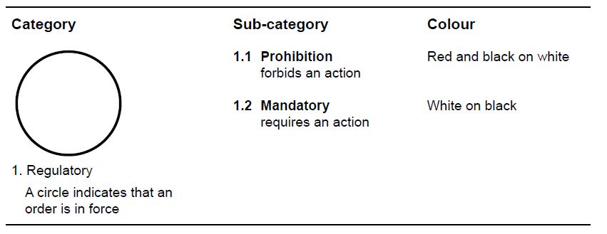
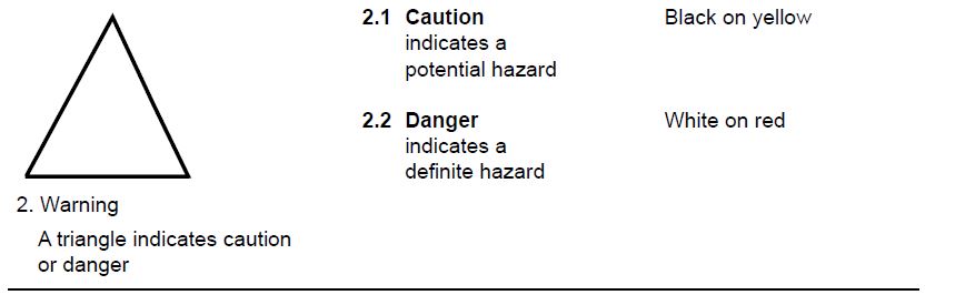
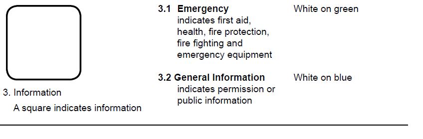
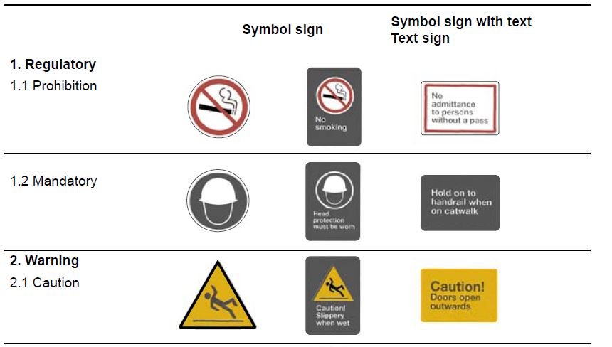
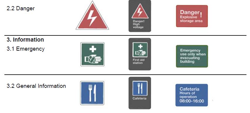
Sign Categories:
As shown in the table below, there are three basic sign categories used in the workplace:
- regulatory
- warning
- information
Each category is distinguished by its shape. These categories are divided into sub-categories that can be recognized by their color.
Sign Types
One of three sign types should be used to communicate a message:
- Symbol sign
- Symbol sign with text
- Text sign
Use symbols that are simple and easy to learn and recognize. Include simple wording (text) to help explain the meaning of the symbol or to provide more information. Text signs should only be used when no appropriate symbols exist.
Safety Sign and Color Use
After determining your needs, work with your health and safety representative or committee to set standards for signs and colors to use throughout the workplace.
Ensure the signs and colors are used consistently. Research shows that companies that have implemented a uniform sign and color system to make hazards more visible and easy to identify have successfully lowered their injury frequency rates. Workers know that signs and colors mean the same thing even when they work in different departments or plant locations. It also enables employees to quickly locate first aid, fire fighting and other emergency equipment.
The signs and colors in your workplace should provide enough information for persons to protect their health and safety. Signs, especially those that indicate hazards, should:
- attract a person’s attention
- clearly identify the nature of the hazard
- specify the immediate action required
- be posted in a place that provides enough time for a person to read the sign and act accordingly
- be easily recognized and understood by all employees
- reflect the needs of those who have visual limitations or who do not speak English
- be sized or placed according to the importance of the message
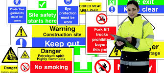
Posting Signs
- Signs should be clearly visible, positioned in the line of sight, and free from any obstructions or clutter.
- Keep signs well-lighted. Observers should be able to read a sign easily and recognize its safety color. Lighting should also be sufficient to make any hazard clearly visible.
- Post the sign within an appropriate distance from the hazard it is pointing out. An observer must have enough time to see and read the sign and do whatever is necessary to keep safe.
- In general, signs should be displayed alone. When signs must be grouped together, place them in an appropriate order. Use no more than three symbols in the same location.
- Use no more than three symbols in the same location.
- Ensure that directional signs are visible from all directions. Include arrows on exit signs wherever the direction is not obvious. Directional signs should be posted at a consistent height throughout the workplace. They should also be posted at appropriate locations or decision points so that the route to take is always clear
- Using Easy to Read and Easy to Understand Signs
- Help employees and workplace visitors understand signs quickly by using clear language and symbols than can be learned and recognized easily.
- Keep symbols as simple as possible; eliminate details that don’t make the message clearer.
- Avoid using signs that contain only text messages.
- A combination of text and symbols is generally the most effective. Consider multilingual signs if you have employees who do not speak English.
Click the below link to know and download more than 50 different safety posters topics